Use live type for your logo, or replace the text boxes with an image. Be sure to include both the full colour and reversed versions of your logo. Change your logo inside the symbol and it will automagically update everywhere else it appears (Like the top left of this style guide!).
logo-primary
logo-reversed
logo-small
Color scale uses a similar structure to Material Design. Every color is called by name, has a 100 tint value and a scale of lighter tints. I've also included their darker shades of 110 that cover AA accessibility.
is--color-primary
Annoncement bar, Background,
is--color-primary-080
Hover
is--color-primary-040
Background, shadows
is--color-primary-060
seperating background
is--color-primary-010
#f7f6f2
is--color-secondary
#cf6653
is--color-secondary-090
#edba8e
is--color-secondary-030
#F1DDCD
is--color-secondary-010
#F4ECE6
is--color-tertiary
Links, Backrgound, Hover States, icons
is--color-tertiary-080
#EDDCD2
is--color-error
AA accessible Copy
Icons
Buttons background. and borders
is--color-warning-080
Hover State
is--color-error-060
bacgrounds
is--color-success
AA accessible Copy
Icons
Buttons background. and borders
is--color-success-080
Hover State
is-color-success-060
bacgrounds
is-color-warning
AA accessible Copy
Icons
Buttons background. and borders
is--color-warning-080
is--color-warning-060
color-Neutral-100
Body Copy
color-Neutral-080
#353434
color-Neutral-060
Subtle copy
Inactive form field copy
Hover
Disabled Copy
color-Black
Limited use.
Some headings
Keylines
color-White
Limited use
Backgrounds
Reversed Copy
Surfaces are used to emulate real-world depth at various levels of elevation where a light source is casting a shadow from the surface onto the layer below it. The higher the elevation value, the more diffused the shadow becomes and we have 8 levels to choose from.
surface-L1
surface-L2
surface-L3
surface-L4
surface-L5
surfaceL-6
surface-L7
surface-L8
Our type-scale adheres to a 4-8pt scale, starting with small body text and heading right up to a large heading class called Title. Heading styles use Obviously Book and Regular and paragraphs use Benton Sans Regular, both of which are Adobe fonts from subscription.
t1: Left, Center and Right. 56/64 on Desktop and 40/48 on mobile.
h1: Left, Center and Right. 48/60 on Desktop and 32/40 on mobile.
h2: Left, Center and Right. 32/40 on Desktop and 24/32 on mobile.
h3: Left, Center and Right. 24/32 on Desktop and 20/28 on mobile.
h4: Left, Center and Right. 16/24 on Desktop and mobile.
#ff5252
#536dfe
p L
p C
p R
p: Left, Center and Right. 16/24.
#444444
p L
p C
p R
pN60: Left, Center and Right. 16/24.
#888888
p L
p C
p R
pR100: Left, Center and Right. 16/24.
#ff5252
p L
p C
p R
pSmall: Left, Center and Right. 14/18.
#444444
p L
p C
p R
pSmallN60: Left, Center and Right. 14/18.
#888888
p L
p C
p R
pSmallR100: Left, Center and Right. 14/18.
#ff5252
Unordered and ordered lists
#444444
White text values.
t1: Left, Center and Right. 56/64 on Desktop and 40/48 on mobile.
#FFFFFF
h1: Left, Center and Right. 40/48 on Desktop and 32/40 on mobile.
#FFFFFF
h2: Left, Center and Right. 32/40 on Desktop and 24/32 on mobile.
#FFFFFF
h3: Left, Center and Right. 24/32 on Desktop and 20/28 on mobile.
#FFFFFF
h4: Left, Center and Right. 16/24 on Desktop and mobile.
#FFFFFF
p L
p C
p R
p: Left, Center and Right. 16/24.
#FFFFFF
p L
p C
p R
pSmall: Left, Center and Right. 14/18.
#FFFFFF
Unordered and ordered lists
#FFFFFF
A starter set of SVG icons in 16 and 24px sizes.


Starting with four image aspect ratios of landscape, portrait, square and avatar. These images have been placed inside parent DIVs that keep their aspect ratios when the page is resized. There's also a banner version that uses a background image that's been set to "Cover".
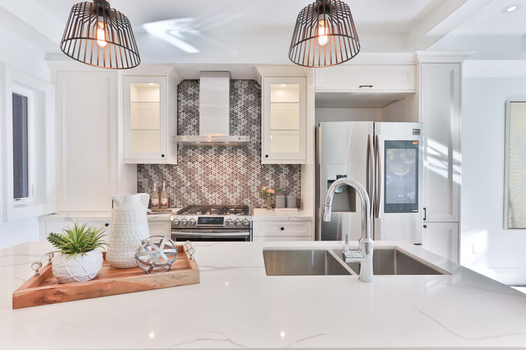
image-landscape-banner with a background image set to "Cover" in 100% wrapper
image-portrait

image-square


image-avatar in 86x86px wrapper "is--small"
We take Webflow's default styles and style them with Dezin's global styles.
Webflow comes with two main video embed objects. One that just displays the video via a url and another Youtube one that lets you adjust playback and privacy controls.
Basic video embed. Just replace the video url and you're good to go.
We take Webflow's clean, simple tabs and style them with the global styles.
Tab 1 content
Tab 2 content
Tab 3 content
© Arq Design Studio. 2020 | Adapted from Dezgn